
- Published on
Build a React Native Twitter UI Replica
- Authors

- Name
- Gbenga Oni
- @gbxnga
Learn Hand-On AWS Cloud EngineeringHERE
For this app, we will need access to a simple api we can get random data from so we will go with RandomUser Api.
React native is very powerful and its amazing the amount of magic that can be achieved with it.
Lets setup a fresh react native environment:
react-native init Twitter
Cd into our project folder and run the fresh app on either IOS or Androidemulator. We will use the android emulator in the course of this article.
cd Twitter
Command to run our app on the android emulator (Make sure you have your android emulator already running) :
react-native run-android
For IOS:
react-native run-ios
Great! Now that our environment is set up, lets get our hands dirty. We will install all dependencies needed to build our Twitter app. We will be making use of React Navigation — a routing and navigation helper for React Native apps built to replace the now deprecated NavigatorExperimental and the not so powerful Navigator, a JS-based solution launched with React Native.
We will also be using Axios — a promise based http client for javascript — to make api calls for data fetching, and also React Native Vector Icons.
To install these dependencies, run the following command in your Twitterdirectory:
npm install react-navigation axios react-native-vector-icons
Run
_npm install_again incase you encounter any errors after refresh
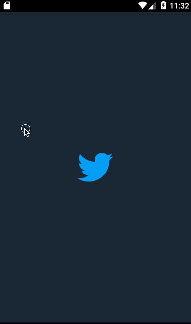
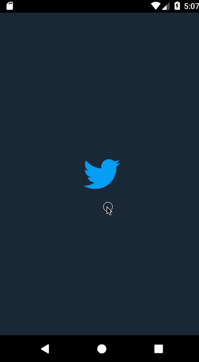
We want to create a LoadingScreen component. This is usually where authentication and necessary local app data fetching is done before switching to the main app. We wont be performing any authentication but we will be having a screen that displays the huge twitter bird, the one that comes on when the Twitter app is opened. Let’s create a LoadingScreen component for this:
Create a Loading.js file in your /screens folder. We will use the Entypo twitter logo, which will be placed at the center of the screen. The Loading.js file should look like this:
import React from 'react';
import {
  StatusBar,
  View,
  StyleSheet
} from 'react-native';
import Entypo from 'react-native-vector-icons/Entypo'
export default class LoadingScreen extends React.Component {
  constructor(props) {
    super(props);
  }

  componentDidMount() {
    /** Simulate asynchronus authentication for 0.5s */
    setTimeout(() => {
      this.props.navigation.navigate('App')
    }, 500) /** Navigate to App Screen in 0.5s **/
  }

  render() {
    return (
      <View style={styles.container}>
        <StatusBar barStyle="default" color="rgb(27, 40, 54)"/>
        <Entypo name={'twitter'} size={70} style={styles.logo}/>
      </View>
    );
  }
}

const styles = StyleSheet.create({
  container: {
    flex: 1,
    justifyContent: 'center',
    alignItems: 'center',
    backgroundColor: 'rgb(27, 40, 54)'
  },
  logo: {
    alignSelf: "center",
    color: 'rgb(29, 161, 242)'
  }
});
Now lets go back to our App.js file. We will remove the export default in front of the App class, then export in its stead the AppNavigator, a SwitchNavigator that switches between the loading screen and the app screen, setting the LoadingScreen as the initial route, that is when we open the app, the LoadingScreen is displayed first.
export default AppNavigator = SwitchNavigator(
  {
    AuthLoading: LoadingScreen,
    App: App,
  },
  {
    initialRouteName: 'AuthLoading',
  }
);
Make sure you import the LoadingScreen and the SwitchNavigator:
import {SwitchNavigator} from ‘react-navigation’
import LoadingScreen from ‘./screens/Loading’
Lets reload the app to see changes made:
Note: if you are using an android emulator and the twitter icon happens to not show, add the following line to your **andoid/app/build.gradle**file:
apply from: “../../node\_modules/react-native-vector-icons/fonts.gradle”
save, then run react-native run-android again.
😀 Our SwitchNavigator now works perfectly, switching between the LoadingScreen and the App
Creating the App
As everyone who has or is using the Twitter app knows, Twitter uses a slidable drawer navigator. Lets implement this in our App stack.
create a AppStack drawer Navigator with the createDrawerNavigatorfunction provided by react-navigation:
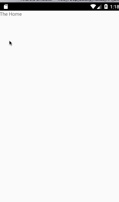
const  AppStack = createDrawerNavigator(
  {
    Home: () => <View style={{flex:1}}><Text>The Home</Text></View>,
    Profile: () => <View style={{flex:1}}><Text>Profile Page</Text></View>,
  }
);
The AppStack component will contain links to the Home and Profile page.
Replace the App component to which the App route in our previous AppNavigator component points to with our newly created AppStackcomponent. This way, when the SwitchNavigator, switches from the LoadingScreen to the App screen, it points to the AppStack component.
{
   AuthLoading: **LoadingScreen**,

   App: **AppStack**,
}
Make sure you import the createStackNavigation function from react-navigation :
import {SwitchNavigator**, **createDrawerNavigator**} from 'react-navigation'
Lets refresh our app to see these changes; do this by hitting the ‘R’ key twice on your keyboard, if your are using an emulator, or otherwise by shaking your physical device.
Our drawer navigator now works.
React Native offers a default look for drawer navigators but in this case we need to design this to look as it would in a real Twitter app.
This is where the custom content component for React Navigation drawers come in.
We can achieve this by specifying a custom component with the contentComponentproperty of the createDrawerNavigatorfunction:
const  AppStack = createDrawerNavigator(
  {
    Home: () => <View style={{flex:1}}><Text>The Home</Text></View>,
    Profile: () => <View style={{flex:1}}><Text>Profile Page</Text></View>,
  },
  {
    contentComponent: ({navigation}) => <DrawerContainer  navigation={navigation}/>
  }
);
We tell createDrawerNavigator through its contentComponent props to use the DrawerContainer component we will be creating as its default look.
Now lets create the DrawerContainer component:
Create a screens/DrawerContainer.js file:
import React from 'react'
import {
  StyleSheet,
  Text,
  View,
  Image,
  TouchableOpacity,
  ScrollView
} from 'react-native'
import {NavigationActions, DrawerActions} from 'react-navigation'

import FontAwesome from 'react-native-vector-icons/FontAwesome'
import Ionicons from 'react-native-vector-icons/Ionicons'
import MaterialCommunityIcons from 'react-native-vector-icons/MaterialCommunityIcons'

export default class DrawerContainer extends React.Component {


  render() {
    const {navigation} = this.props
    return (
      <View style={styles.container}>
        <View style={styles.top}>
          <Image
            onPress={() => this.props.navigation.navigate('Profile')}
            source={require('../assets/images/avatar.png')}
            style={styles.photo}/>
          <Text style={styles.userName}>Maverick 😎 </Text>
          <Text style={styles.userHandle}>@Gbenga </Text>

          <View>
            <Text style={styles.followingCount}>970
              <Text
                style={styles.followingText}>Following</Text>
            </Text>
            <Text style={styles.followersCount}>1,325
              <Text
                style={styles.followersText}>Followers</Text>
            </Text>
          </View>

        </View>

        <ScrollView>
          <TouchableOpacity
            onPress={() => navigation.navigate('Profile')}
            style={[ styles.list, styles.firstList]}>
            <View>
              <FontAwesome
                style={styles.icon}
                name='user-o'
                size={20}
                color="rgb(136, 153, 166)"/>
              <Text style={styles.text}> Profile </Text>
            </View>
          </TouchableOpacity>
          <TouchableOpacity onPress={() => this.props.navigation.navigate('Site')} style={styles.list}>
            <View>
              <Ionicons
                style={styles.icon}
                name='ios-list-box-outline'
                size={20}
                color="rgb(136, 153, 166)"/>
              <Text style={styles.text}> Lists </Text>
            </View>
          </TouchableOpacity>
          <TouchableOpacity style={styles.list}>
            <View>
              <FontAwesome
                style={styles.icon}
                name='bookmark-o'
                size={20}
                color="rgb(136, 153, 166)"/>
              <Text onPress={() => navigation.navigate('Profile')} style={styles.text}> Bookmarks </Text>
            </View>
          </TouchableOpacity>
          <TouchableOpacity
            style={[
            styles.list, {
              borderBottomWidth: 0.3,
              borderBottomColor: 'black'
            }
          ]}>
            <View>
              <Ionicons
                style={styles.icon}
                name='md-analytics'
                size={20}
                color="rgb(136, 153, 166)"/>
              <Text onPress={() => navigation.navigate('Profile')} style={styles.text}> Moments </Text>
            </View>
          </TouchableOpacity>
          <TouchableOpacity style={styles.list}>
            <View>
              <MaterialCommunityIcons
                style={styles.icon}
                name="arrow-top-right"
                size={20}
                color="rgb(136, 153, 166)"/>
              <Text onPress={() => navigation.navigate('Profile')} style={styles.text}> Twitter Ads </Text>
            </View>
          </TouchableOpacity>
          <TouchableOpacity style={styles.list}>
            <View>
              <Text
                onPress={() => navigation.navigate('Profile')}
                style={[
                styles.text, {
                  left: 20
                }
              ]}>
                Settings and privacy
              </Text>
            </View>
          </TouchableOpacity>
          <TouchableOpacity style={styles.list}>
            <View>
              <Text
                onPress={() => navigation.navigate('Profile')}
                style={[
                styles.text, {
                  left: 20
                }
              ]}>
                Help Centre
              </Text>
            </View>
          </TouchableOpacity>
        </ScrollView>
      </View>
    )
  }
}

const styles = StyleSheet.create({
  container: {
    flex: 1,
    backgroundColor: 'rgb(27, 42, 51)',
    paddingTop: 10
  },
  list: {
    padding: 10,
    height: 60,
    borderColor: 'red',
    borderWidth: 0
  },
  text: {
    position: "absolute",
    left: "24%",
    top: 10,
    color: "white",
    fontSize: 16
  },
  top:{
    paddingBottom: 40,
    paddingLeft: 30,
    marginBottom:10
  },
  photo: {
    width: 50,
    height: 50,
    borderRadius: 30,
    marginTop: 20
  },
  userName:{
    marginTop: 15,
    color: "white",
    fontWeight: "bold"
  },
  userHandle:{
    marginTop: 15,
    color: "rgb(136, 153, 166)",
    fontWeight: "300"
  },
  followingCount:{
    color: "white",
    position: 'absolute',
    left: 0,
    top: 10,
    fontWeight: "bold"
  },
  followingText:{
    color: "rgb(136, 153, 166)",
    fontWeight: "300"
  },
  followersCount:{
    color: "white",
    position: 'absolute',
    right: 30,
    top: 10,
    fontWeight: "bold"
  },
  followersText:{
    color: "rgb(136, 153, 166)",
    fontWeight: "300"
  },
  firstList:{
    marginTop: 0,
    borderTopWidth: 0.3,
    borderTopColor: 'black',
    height: 60,
    borderTopWidth: 0.3,
    borderTopColor: 'black'
  },
  icon:{
    position: "absolute",
    left: 20,
    top: 10
  }
})
Import the DrawerContainer:
import DrawerContainer from './screens/DrawerContainer'
Lets refresh the app to see the changes:
We now have a custom drawer navigator.
For y’all Twitter DayMode lovers, sorry NightMode fan here 😜
The custom drawer component receives the navigation props from the Drawer Navigator. This enables the routing to the other screens in the drawer by calling itsnavigate method, for instance:
_onPress_\=_{_() _\=>_ navigation.navigate('_Profile_')_}_
The above code routes the user to the Profile route registered in the Drawer Navigator.
You can specify your own image in the stead of the avatar.png image used in the drawer navigator.
Now that our Drawer Navigator is up and running, lets design the home page, which will contain a TabNavigator of four tabs: Home, Search, Notifications, DM.
The TabNavigator in React Native provides a tab-based style of navigation, one very common on most mobile apps. They can be positioned either at the top or at the bottom of the screen.
Twitter uses a bottom tab navigator, so we will be creating a bottom tab navigator with the createTabNavigator function, which has other derivates like the createMaterialBottomTabNavigator and createMaterialTopTabNavigator, although outside the scope of this article. But you can refer to the official React Navigation documentation for a more comprehensive information.
Lets create a Tab Navigator:
const HomeTabs =  createTabNavigator({
  Home: {
    screen: Home,

  },
  Search: {
    screen: DummyScreen,
    navigationOptions: {
      tabBarLabel: 'Search',
    }
  },
  Notification: {
    screen: DummyScreen,
    navigationOptions: {
      tabBarLabel: 'Notification',
    }
  },
  DM: {
    screen: DummyScreen,
    navigationOptions: {
      tabBarLabel: 'DM',
    }
  },

},
{
  navigationOptions: ({ navigation }) => ({
    tabBarIcon: ({ focused, tintColor }) => {
      const { routeName } = navigation.state;

      switch (routeName){

        case "Home":
          return <Octicons name={'home'} size={30} color={ focused ? 'rgb(29, 161, 242)':'rgb(136, 153, 166)'} />

        case "Search":
          return <EvilIcons name={'search'} size={35} color={ focused ?  'rgb(29, 161, 242)':'rgb(136, 153, 166)'} />

        case "Notification":
          return <Ionicons
                  name={'ios-notifications-outline'}
                  size={30}
                  style={{ color: focused ?  'rgb(29, 161, 242)':'rgb(136, 153, 166)' }}
                />

        case "DM":
          return <FontAwesome
                  name={'envelope-o'}
                  size={26}
                  style={{ color: focused ? 'rgb(29, 161, 242)':'rgb(136, 153, 166)' }}
                />

      }
    },
  }),


  tabBarPosition: 'bottom',
  //tabBarComponent: (props) => <CustomTabComponent {...props}/>,
  animationEnabled: true,
  tabBarOptions: {
    showIcon: true,
    showLabel:false,
    showIndicator:false,
    titleStyle: {
        justifyContent: 'center',
        alignItems: 'center',
    },
    style: {
        borderWidth: 0,
        position:'absolute',
        bottom:0,
        left:0,
        width:'100%',
        backgroundColor: 'rgb(27, 42, 51)',
        borderColor: 'rgb(27, 42, 51)',
        shadowColor:'red',
        elevation:2
    },
    activeBackgroundColor: 'rgb(0, 79, 114)',
    inactiveBackgroundColor: 'rgb(27, 42, 51)',
    labelStyle: {
        fontSize: 14,
        color: '#fff',
        position: 'relative',
        alignSelf: 'center',

    },
    iconStyle:{
      marginBottom:5,
      marginTop:5
    },
    tabStyle: {
        justifyContent: 'center',
        alignItems: 'center',

    },
    indicatorStyle: {
      backgroundColor: 'transparent',
  },
},
});
HomeTabs.js The HomeTabs component is created with the createTabNavigator function which takes objects as arguments, specifying the route name and their corresponding components, and also the navigation options through the object’s navigationOptions property.
We have specified icons that will represent each of these tabs through the navigationOptions property, which is a function that accepts an object argument with atabBarIcon props.
Lets import all the react-native-vector-icons types used :
import Ionicons from 'react-native-vector-icons/Ionicons'

import Octicons from 'react-native-vector-icons/Octicons'

import EvilIcons from 'react-native-vector-icons/EvilIcons'

import FontAwesome from 'react-native-vector-icons/FontAwesome'
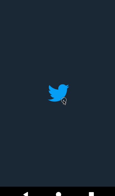
For this article, we will only design the Home tab, which is your regular timeline with series of tweets. We will however create a dummy page for the rest of the tabs (Search, Notifications and DM).
Dummy Page:
The Dummy page is a component that displays a blank page with the huge twitter icon at its center, just like we did for the LoadingScreen component.
class DummyScreen extends Component {
  render() {
    return (
      <View style={styles.container}>
          <Entypo name={'twitter'} size={70} style={{color: 'rgb(29, 161, 242)'}} />
      </View>
    );
  }
}
DummyScreen.js
Don’t forget to import the Entypo icon:
import Entypo from 'react-native-vector-icons/Entypo'
Now that we have our DummyScreen for the rest of the tabs, lets create a simple page for the home tab then check to see what our app looks like:
- Replace the yet to exist
Homecomponent that the Home route of ourHomeTabscomponent points to with a page that displays ‘hello, this is your timeline’:
Home: {

screen: ()=> <View>
                   <Text>Hello, this is your timeline</Text>
                 </View>,

},
Search: {

.
.
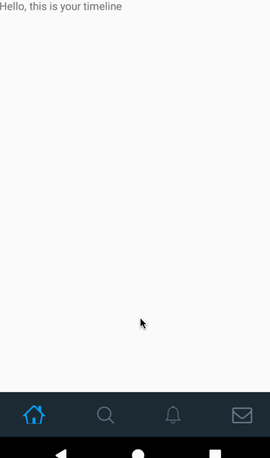
We are getting there!!
We have successfully set up our tab navigator.
On clicking the home icon, we are taken to the screen that shows “Hello, this is your timeline”.
We will now redesign this page to contain tweets like it would on a timeline.
Designing the Timeline:
The timeline will be a ListViewwhich we will give a padding at the top that equals the navigation bar — which will have an absolute positioning — in height.
const NAVBAR_HEIGHT = 64;
const STATUS_BAR_HEIGHT = Platform.select({ ios: 20, android: 24 });

export default class Home extends Component {
  render() {
    return (
      <View style={styles.fill}>
        <ListView
          contentContainerStyle={{paddingTop: NAVBAR_HEIGHT}}
          dataSource={this.state.dataSource}
          renderRow={this._renderRow}
        />
        <View style={{height:NAVBAR_HEIGHT, paddingTop:STATUS_BAR_HEIGHT}}>
          <Text> PLACES </Text>
        </View>
      </View>
    );
  }
}
We will have 3 animated values:
scrollAnimatedValue: representing the current scroll y position of ourListViewnavOffsetAnimatedValue: this will help us position the navigation bar. With it, we can decide to show or hide the navigation bar at the end of each scroll, depending on the direction of said scroll.clampedScroll: This will help us animate the navigation bar. It is the result of the addition ofscrollAnimatedValueandnavOffsetAnimatedValuegiven to theAnimated.diffClampfunction. It will help show the navigation bar when scrolling up and to hide it when scrolling down.
Read more about Animated.diffClamp here
    ...

    export default class Home extends Component {
        constructor(props) {


        const scrollAnim = new Animated.Value(0);
        const offsetAnim = new Animated.Value(0);

        this.state = {
          dataSource: dataSource.cloneWithRows(data),
          scrollAnim,
          offsetAnim,
          clampedScroll: Animated.diffClamp(
            Animated.add(
              scrollAnim.interpolate({
                inputRange: [0, 1],
                outputRange: [0, 1],
                extrapolateLeft: 'clamp',
              }),
              offsetAnim,
            ),
            0,
            NAVBAR_HEIGHT - STATUS_BAR_HEIGHT,
          ),
        };
      }

      ...

    }
Now lets attach the animated values to the views and also add some interpolations in order to map them to the translation of the navigation bar view.
Read more about React native Animated here
    export default class Home extends Component {

        ...

      _clampedScrollValue = 0;
      _offsetValue = 0;
      _scrollValue = 0;

      componentDidMount() {
        this.state.scrollAnim.addListener(({ value }) => {
          // This is the same calculations that diffClamp does.
          const diff = value - this._scrollValue;
          this._scrollValue = value;
          this._clampedScrollValue = Math.min(
            Math.max(this._clampedScrollValue + diff, 0),
            NAVBAR_HEIGHT - STATUS_BAR_HEIGHT,
          );
        });
        this.state.offsetAnim.addListener(({ value }) => {
          this._offsetValue = value;
        });
      }

      componentWillUnmount() {
        // Don't forget to remove the listeners!
        this.state.scrollAnim.removeAllListeners();
        this.state.offsetAnim.removeAllListeners();
      }

        _onScrollEndDrag = () => {
          this._scrollEndTimer = setTimeout(this._onMomentumScrollEnd, 250);
        };

        _onMomentumScrollBegin = () => {
          clearTimeout(this._scrollEndTimer);
        };

        _onMomentumScrollEnd = () => {
            // Code to handle scroll end animation will go here.
            const toValue = this._scrollValue > NAVBAR_HEIGHT &&
              this._clampedScrollValue > (NAVBAR_HEIGHT - STATUS_BAR_HEIGHT) / 2
              ? this._offsetValue + NAVBAR_HEIGHT
              : this._offsetValue - NAVBAR_HEIGHT;

            Animated.timing(this.state.offsetAnim, {
              toValue,
              duration: 350,
              useNativeDriver: true,
            }).start();
        };

      render() {

        const { clampedScroll } = this.state;

        const navbarTranslate = clampedScroll.interpolate({
          inputRange: [0, NAVBAR_HEIGHT - STATUS_BAR_HEIGHT],
          outputRange: [0, -(NAVBAR_HEIGHT - STATUS_BAR_HEIGHT)],
          extrapolate: 'clamp',
        });
        const navbarOpacity = clampedScroll.interpolate({
          inputRange: [0, NAVBAR_HEIGHT - STATUS_BAR_HEIGHT],
          outputRange: [1, 0],
          extrapolate: 'clamp',
        });

        return (
          <View style={styles.fill}>
            <AnimatedListView
              contentContainerStyle={{paddingTop: NAVBAR_HEIGHT}}
              dataSource={this.state.dataSource}
              renderRow={this._renderRow}

              scrollEventThrottle={1}
              onScroll={Animated.event(
                [{ nativeEvent: { contentOffset: { y: this.state.scrollAnim } } }],
                { useNativeDriver: true },
              )}

              onMomentumScrollBegin={this._onMomentumScrollBegin}
              onMomentumScrollEnd={this._onMomentumScrollEnd}
              onScrollEndDrag={this._onScrollEndDrag}

            />
            <Animated.View style={{height:NAVBAR_HEIGHT, paddingTop:STATUS_BAR_HEIGHT, transform: [{ translateY: navbarTranslate }] }}>
              <Animated.Text style={{opacity: navbarOpacity}}> PLACES </Animated.Text>
            </Animated.View>
          </Animated.View>
        );
      }
    }
When the user stops scrolling, and the navigation bar is half collapsed, it will look better to render it either to a fully displayed state or a fully hidden state. We will achieve this by adding functionalities to detect the event at which a scroll ends :onScrollEndDrag ,onMomentumScrollBegin and onMomentumScrollEndfunctions.
A short timer is started at onScrollEndDrag and its cleared in onMomentumScrollBegin .
When the user scrolls normally, the method that handles animating the navigation bar is delayed for some milliseconds before its called. On the other hand, if its a fast/momentous scroll, the timer is cleared and our method will get called in onMomentumScrollEnd.
That said, we need to know whether to hide or show the navigation bar, which requires that we know the values of the Animated values used.
We will achieve this by adding listeners to said values then save it in an instance variable to be accessed in the onMomentumScrollEnd method. Note that the same calculations done in d_iffClamp_ will be done manually because the values returned from Animated.diffClamp does not support the addition of listeners.
componentWillUnmount() {

this.state.scrollAnim.removeAllListeners();
    this.state.offsetAnim.removeAllListeners();
}
The onMomentumScrollEnd method contains the logic to hide or show the navigation bar. We will animate the offset. By adding to its current value, the navigation bar is hidden, while its shown by subtracting from its current value:
_onMomentumScrollEnd = () => {
  const toValue = this._scrollValue > NAVBAR_HEIGHT &&
    this._clampedScrollValue > (NAVBAR_HEIGHT - STATUS_BAR_HEIGHT) / 2
    ? this._offsetValue + NAVBAR_HEIGHT
    : this._offsetValue - NAVBAR_HEIGHT;

  Animated.timing(this.state.offsetAnim, {
    toValue,
    duration: 350,
    useNativeDriver: true,
  }).start();
};
We check the clampedScrollValue whether or not it’s passed half of the navigation bar. We will also make sure we don’t hide it while we haven’t scrolled yet, to avoid showing a blank space where the navigation bar is supposed to be.
Now that we have setup the animation for the timeline, we can proceed to implement a ListView of tweets.
Creating a reusable tweet component
Create a screens/Tweet.js file. Tweet.js will be a reusable component used across the app which displays a singular tweet as shown in the image below.

We will design our Tweet.js component like the above then import it to the home screen (Home.js)
import React from 'react'
import {
  StyleSheet,
  View,
  Text,
  Image,

  TouchableHighlight,
  TouchableOpacity,
} from 'react-native'
import PropTypes from 'prop-types';
import EvilIcons from 'react-native-vector-icons/EvilIcons'
import Entypo from 'react-native-vector-icons/Entypo'
import SimpleLineIcons from 'react-native-vector-icons/SimpleLineIcons'

import randomWords from 'random-words'


const userImage = {uri : 'https://pbs.twimg.com/profile_images/951903664809050114/Grfd40ih_400x400.jpg'}
Array.prototype.random = function () {
  return this[Math.floor((Math.random()*this.length))];
}
String.prototype.capitalizeFirstLetter = function() {
  return `${this.substr(0,1).toUpperCase()}${this.substr(1)}`;
}
export default class Tweet extends React.Component {

  constructor(props) {
    super(props)
    const {tweet, name, handle, time, retweeted, liked, picture} = this.props
    const twit = randomWords({min: 18, max: 40}).join(" ");
    this.state = {
      photo: {uri :  picture.thumbnail},
      touched: false,
      tweet: twit,
      retweets:Math.floor((Math.random() * 100) + 1),
      likes:Math.floor((Math.random() * 10) + 1),
      name: `${name.first.capitalizeFirstLetter()} ${name.last.capitalizeFirstLetter()}`,
      handle: `@${name.first}`,
      time: "1hr",
      retweeted: [true, false].random(),
      liked: [true, false].random(),
      retweetedBy:["Sandra", "Hannit","Michael", "Jason", "Queen"][Math.floor(Math.random()*["Sandra", "Hannit","Michael", "Jason", "Queen"].length)]
    }
    this.tweetPressed = this
      .tweetPressed
      .bind(this)

    this.retweet = this.retweet.bind(this)
    this.like = this.like.bind(this)
  }

  tweetPressed(pressed = false) {

    this.setState({touched: pressed})
  }

  retweet(){

    const {retweeted, retweets} = this.state


    if (retweeted)
      this.setState({retweeted: false, retweets: retweets-1})


    else this.setState({retweeted: true, retweets: retweets+1})
  }
  like(){
    const {liked, likes} = this.state


    if (liked)
      this.setState({liked: false, likes: likes-1})


    else this.setState({liked: true, likes: likes+1})
  }

  render() {

    const {navigation, thekey, isReply} = this.props
    const {touched, tweet, retweets, likes, name, handle, time, retweetedBy, retweeted, liked, photo} = this.state


    return(
      <TouchableHighlight onPress={()=>navigation.navigate('Thread')} onPressIn={() => this.tweetPressed(true)} onPressOut={() => this.tweetPressed()}>
        <View key={thekey} style={styles.container}>
            { !isReply ?
            <View style={styles.isReplyContainer}>

                <View style={{flex:0.23, borderColor:"red", borderWidth:0, alignItems:"flex-end"}}>
                  <EvilIcons  name={'retweet'} size={25} color={'rgb(136, 153, 166)'}/>
                </View>
                <Text style={{flex:0.5, color:"rgb(136, 153, 166)"}}>{retweetedBy} Retweeted</Text>
            </View>
            :
            true
            }
            <View style={styles.innerContainer}>

              <View style={styles.photoContainer}>
                <View style={styles.innerPhotoContainer}>
                  <TouchableOpacity

                  onPress={() => navigation.navigate('Profile')}>
                  <Image
                    source={photo}
                    style={styles.photo}/>
                  </TouchableOpacity>
                </View>
              </View>
              <View style={styles.info}>

                <View style={styles.userDetails}>
                  <Text style={styles.userName}>{name}
                    <Text style={styles.userHandleAndTime}>{handle} · {time}</Text>
                  </Text>
                </View>
              <View style={styles.tweetTextContainer}>
                <Text style={styles.tweetText}>{tweet}</Text>

              </View>
              <View style={styles.tweetActionsContainer}>
                <TouchableOpacity style={styles.commentButton}>
                  <EvilIcons name={'comment'} style={styles.commentButtonIcon} size={25} color={'rgb(136, 153, 166)'}/>
                <Text style={styles.commentsCount}>20</Text>
                </TouchableOpacity>
                <TouchableOpacity onPress={()=> this.retweet()}  style={styles.retweetButton}>
                  <EvilIcons name={'retweet'} size={25} color={(retweeted) ? "rgb(23, 191, 99)":'rgb(136, 153, 166)'}/>
                  <Text style={[styles.retweetButtonIcon, {color: retweeted ? "rgb(23, 191, 99)" : "rgb(136, 153, 166)",fontWeight: retweeted ? "bold" : "300",}]}>{retweets}</Text>
                </TouchableOpacity>
                <TouchableOpacity onPress={()=> this.like()}  style={styles.likeButton}>
                { liked ?
                  <Entypo name={'heart'} size={18} style={{marginLeft:4}} color={liked ? "rgb(224, 36, 94)" : 'rgb(136, 153, 166)'}/>
                  :
                  <EvilIcons name={'heart'} size={25} color={liked ? "rgb(224, 36, 94)" : 'rgb(136, 153, 166)'}/>

                }
                <Text style={[styles.likeButtonIcon, {color: liked ? "rgb(224, 36, 94)" : "rgb(136, 153, 166)",fontWeight: liked ? "bold" : "300",}]}>{likes}</Text>
                </TouchableOpacity>
                <TouchableOpacity style={styles.shareButton}>

                  <SimpleLineIcons name={'share'} size={16} color={'rgb(136, 153, 166)'}/>

                </TouchableOpacity>
              </View>

              </View>
            </View>
        </View>
       </TouchableHighlight>

    )
  }

}
const styles = StyleSheet.create({
  container: {
    flex: 1,
    borderBottomColor: "black",
    borderBottomWidth: 0.5,
    flexDirection: "column",
    backgroundColor: "#1b2836"
  },
  isReplyContainer: {
    flex: 1,
    borderColor: "green",
    flexDirection: "row",
    borderWidth: 0,
    height: 20,
    marginTop: 5
  },
  innerContainer: {
    flex: 1,
    borderColor: "green",
    flexDirection: "row",
    borderWidth: 0,
    height: "auto"
  },
  photoContainer: {
    flex: 0.23,
    borderColor: "yellow",
    flexDirection: "column",
    borderWidth: 0
  },
  innerPhotoContainer: { height: 100, alignItems: "center" },
  photo: {
    width: 50,
    height: 50,
    borderRadius: 50,
    marginTop: 15
  },
  info: {
    flex: 0.77,
    borderColor: "yellow",
    flexDirection: "column",
    borderWidth: 0
  },
  userDetails: {
    flex: 1,
    borderColor: "blue",
    borderWidth: 0,
    marginBottom: 5
  },
  userName: { color: "white", fontWeight: "bold" },
  userHandleAndTime: {
    color: "rgb(136, 153, 166)",
    marginLeft: 5
  },
  tweetTextContainer: { flex: 1, borderColor: "blue", borderWidth: 0 },
  tweetText: { color: "white", paddingRight: 10 },
  tweetActionsContainer: {
    flex: 1,
    borderColor: "blue",
    borderWidth: 0,
    marginTop: 5,
    flexDirection: "row",
    paddingBottom: 5
  },
  commentButton: {
    paddingLeft: 0,
    flex: 0.25,
    alignItems: "center",
    flexDirection: "row",
    borderColor: "red",
    borderWidth: 0
  },
  commentButtonIcon: {
    margin: 0,
    marginLeft: -4,
    borderColor: "red",
    borderWidth: 0
  },
  commentsCount: {
    position: "absolute",
    left: 27,
    color: "rgb(136, 153, 166)",
    marginLeft: -4
  },
  retweetButton: {
    padding: 5,
    flex: 0.25,
    alignItems: "center",
    flexDirection: "row",
    borderColor: "red",
    borderWidth: 0
  },
  retweetButtonIcon: {
    position: "absolute",
    left: 27,

    marginLeft: 3
  },
  likeButton: {
    padding: 5,
    flex: 0.25,
    alignItems: "center",
    flexDirection: "row",
    borderColor: "red",
    borderWidth: 0
  },
  likeButtonIcon: {
    position: "absolute",
    left: 27,

    marginLeft: 3
  },
  shareButton: {
    padding: 5,
    flex: 0.25,
    alignItems: "center",
    flexDirection: "row",
    borderColor: "red",
    borderWidth: 0
  }
});

Tweet.propTypes = {
  retweeted: PropTypes.string.isRequired
};
Tweet.defaultProps = {
  name: "Anonymous",
  tweet: "A tweet",
  retweeted: false,
  liked: false
};
Tweet.js
Tweet.js uses Random Words module module to generate random words of a certain number as tweet content.
Now that we have a reusable tweet component, we will get random user profiles from the randomuser.me api, and we will generate words as tweet with the Random Words module then pass these data to the tweet component through the ListViewwhich will serve as our timeline.
Here is the final code for our Home.js component:
import React, { Component } from 'react';
import { Animated, Image, Platform, StyleSheet, View, Text, ListView, ActivityIndicator, TouchableOpacity } from 'react-native';
import { DrawerActions} from 'react-navigation'

import axios from "axios"

import Tweet from './Tweet'

const NAVBAR_HEIGHT = 64;
const STATUS_BAR_HEIGHT = Platform.select({ ios: 20, android: 24 });

const AnimatedListView = Animated.createAnimatedComponent(ListView);

export default class Home extends Component {
  constructor(props) {
    super(props);

    const dataSource = new ListView.DataSource({ rowHasChanged: (r1, r2) => r1 !== r2 });

    const scrollAnim = new Animated.Value(0);
    const offsetAnim = new Animated.Value(0);

    this.state = {
      dataSource: [],
      data: false,
      dataSource: [],
      scrollAnim,
      offsetAnim,
      clampedScroll: Animated.diffClamp(
        Animated.add(
          scrollAnim.interpolate({
            inputRange: [0, 1],
            outputRange: [0, 1],
            extrapolateLeft: 'clamp',
          }),
          offsetAnim,
        ),
        0,
        NAVBAR_HEIGHT - STATUS_BAR_HEIGHT,
      ),
    };
  }

  _clampedScrollValue = 0;
  _offsetValue = 0;
  _scrollValue = 0;

  componentDidMount() {
    let ds = new ListView.DataSource({
      rowHasChanged: (r1, r2) => r1 !== r2
  })
    /** Fetch tweets */
    axios.get(`https://randomuser.me/api/?results=10`)
    .then(response => {

      return response
    })
    .then(json => {

      const {results} = json.data

      this.setState({dataSource: ds.cloneWithRows(results), data: true})

    })
    .catch((error) => {
        console.log(` ${error}`)
    });


    this.state.scrollAnim.addListener(({ value }) => {
      const diff = value - this._scrollValue;
      this._scrollValue = value;
      this._clampedScrollValue = Math.min(
        Math.max(this._clampedScrollValue + diff, 0),
        NAVBAR_HEIGHT - STATUS_BAR_HEIGHT,
      );
    });
    this.state.offsetAnim.addListener(({ value }) => {
      this._offsetValue = value;
    });
  }

  componentWillUnmount() {
    this.state.scrollAnim.removeAllListeners();
    this.state.offsetAnim.removeAllListeners();
  }

  _onScrollEndDrag = () => {
    this._scrollEndTimer = setTimeout(this._onMomentumScrollEnd, 250);
  };

  _onMomentumScrollBegin = () => {
    clearTimeout(this._scrollEndTimer);
  };

  _onMomentumScrollEnd = () => {
    const toValue = this._scrollValue > NAVBAR_HEIGHT &&
      this._clampedScrollValue > (NAVBAR_HEIGHT - STATUS_BAR_HEIGHT) / 2
      ? this._offsetValue + NAVBAR_HEIGHT
      : this._offsetValue - NAVBAR_HEIGHT;

    Animated.timing(this.state.offsetAnim, {
      toValue,
      duration: 350,
      useNativeDriver: true,
    }).start();
  };

  _renderRow = (rowData, sectionId, rowId) => {
    return (
      <View style={{flex:1}}>
      <Image key={rowId} style={styles.row} source={{ uri: rowData.image }} resizeMode="cover"/>
        <Text style={styles.rowText}>{rowData.title}</Text>
      </View>
    );
  };
  renderRow(record){

    return(
        <Tweet navigation={this.props.navigation} {...record} />
    )

  }

  render() {
    const { clampedScroll } = this.state;

    const navbarTranslate = clampedScroll.interpolate({
      inputRange: [0, NAVBAR_HEIGHT - STATUS_BAR_HEIGHT],
      outputRange: [0, -(NAVBAR_HEIGHT)],
      extrapolate: 'clamp',
    });
    const navbarOpacity = clampedScroll.interpolate({
      inputRange: [0, NAVBAR_HEIGHT - STATUS_BAR_HEIGHT],
      outputRange: [1, 0],
      extrapolate: 'clamp',
    });

    return (
      <View style={[styles.fill, {backgroundColor:"rgb(27, 40, 54)"}]}>

      { this.state.data ?
        <AnimatedListView
          contentContainerStyle={styles.contentContainer}
          dataSource={this.state.dataSource}
          renderRow={this.renderRow.bind(this)}
          scrollEventThrottle={1}
          onMomentumScrollBegin={this._onMomentumScrollBegin}
          onMomentumScrollEnd={this._onMomentumScrollEnd}
          onScrollEndDrag={this._onScrollEndDrag}
          onScroll={Animated.event(
            [{ nativeEvent: { contentOffset: { y: this.state.scrollAnim } } }],
            { useNativeDriver: true },
          )}
        />

        :
        <View style={[styles.container, styles.horizontal]}>
            <ActivityIndicator size="small" color="rgb(29, 161, 242)" />
        </View>
    }
        <Animated.View style={[styles.navbar, { transform: [{ translateY: navbarTranslate }] }]}>
        <TouchableOpacity style={styles.avatar}>
          <Image
          onPress={() => this.props.dispatch(DrawerActions.openDrawer()) }
          source={require('../assets/images/avatar.png')}
          style={{width:35,height:35, borderRadius:50,marginTop:5,marginLeft:25}}
          />
        </TouchableOpacity>
        <Animated.View>
          <Animated.Text style={[styles.title, { opacity: navbarOpacity }]}>
            Home
          </Animated.Text>
          </Animated.View>
        </Animated.View>
      </View>
    );
  }
}

const styles = StyleSheet.create({
  container: {
    flex: 1,
    justifyContent: 'center',
  },
  horizontal: {
    flexDirection: 'row',
    justifyContent: 'space-around',
    padding: 10
  },
  fill: {
    flex: 1,
  },
  navbar: {
    position: 'absolute',
    top: 0,
    left: 0,
    right: 0,
    alignItems: 'center',
    backgroundColor: 'rgb(27, 42, 51)',
    borderBottomColor: '#dedede',
    borderBottomWidth: 0,
    height: NAVBAR_HEIGHT,
    justifyContent: "flex-start",
    elevation:8,
    flex: 1, flexDirection: 'row'
    //paddingTop: STATUS_BAR_HEIGHT,
  },
  contentContainer: {
    paddingTop: NAVBAR_HEIGHT,
  },
  title: {
    color: 'white',
    fontWeight:"bold"
  },
  row: {
    height: 300,
    width: null,
    marginBottom: 1,
    padding: 16,
    backgroundColor: 'transparent',
  },
  rowText: {
    color: 'white',
    fontSize: 18,
  },
  avatar:{
    marginRight:15
  }
});
Home.js
We are making some progress!
Our timeline screen now contains a ListView of series of tweets generated by fetching random user data and random words to form sentences that acts as their respective tweets.
Here is a link to the Git repo:
gbxnga/Twitter-React-Native-UI
Conclusion:
We have designed a night mode Twitter React Native Replica that utilizes the Random User Api to get random user data and also the Random Words module to generate random sentences in form of tweets. In the Part II of this article, we will design the user profile page, the create tweet screen and the tweet thread screen.