
- Published on
Design Principles for Better Charts
- Authors

- Name
- Gbenga Oni
- @gbxnga
Learn Hand-On AWS Cloud EngineeringHERE
Introduction
The aim of this article is to itemize key criteria that can be used in determining the overall quality of visualizations in accordance to well researched principles and laws. This will form a framework by which the standard of a visualization design can be examined. A portfolio of visualisations that focus on Climate Change was assembled and evaluated using these criteria and recommendation where required are given based on examination.
Quality Criteria
Data-Ink Ratio
Criteria:
The data-ink ratio is the proportion of Ink that is used to present actual data compared to the total amount of ink (or pixels) used in the entire display.
Data-ink should draw the user’s attention to the main point and crux of the data, not to anything else that is irrelevant to it.
Reasoning:
Tufte posited through the Visual Display of Quantitative Information, that the most part of ink on a graphic should present the “sense and substance” of the data. Tufte’s principles related to data-ink ratio includes:
Most importantly, show the data; Data-Ink ratio should be high; Minimize and get rid of non-Data-ink.
Graphical Integrity
Criteria:
A Visualization should be accurate in its representation of data. Without factual representation and conclusion, a visualization is pointless. A visualization should not be biased, misrepresent or skew data in order to influence perception. Furthermore, a visualization should not lie by omission and should provide proper context for the data being visualized.
Reasoning:
Tufte in his book, Visual Display of Quantitative Information, opined that “Graphical excellence begins with telling the truth about the data”. Tufte further went on to itemize two principles that enhance Graphical Integrity:
- The representation of numbers as physically measured on the surface of the graphic itself, should be directly proportional to the numerical quantities represented
- Clear, detailed and thorough labelling should be used
- Designs variations should be avoided in favour of data variations
- Standardised units of measurement should be used when representing money
- Dimensions represented should equal dimensions contained in data
- Graphic must not quote data out of context
Gestalt Principle
Criteria:
A visualization should take into consideration the law of perception and how the brain sees visual information. The visualization should help make sense of visual information as quickly as possible. It should follow the Gestalt Principle of design as at where applicable.
Reasoning:
Gestalt principles are rules of organization of perceptual scenes. Gestalt in literal terms means “Unified Whole”. The principle suggests that people tend to organize visual elements into groups when certain principles are applied.
Max Wertheimer, Wolfgang Köhler and Kurt Koffka developed a set of principles which was later called the Gestalt Law. The Gestalt Law, which is also called the Gestalt Principle comprises of principles that describe how the human brain perceives visual information:
Similarity; Continuation; Closure; Proximity; Figure/Ground; Common Fate; Symmetry and Order.
Pre-attentive Attributes
Criteria:
These are visual properties we notice unconsciously and without much effort. It is processed in the spatial memory, usually in a split second. A visualization should call attention to and emphasize the most important part of the information and also create a visual hierarchy of the data.
Reasoning:
The book Information Visualization: Perception for Design, written by Colin Ware defines the four pre-attentive visual properties as follows: Color, Form, Movement and Spatial Positioning. In Colin Ware’s words: it is easy to spot a single hawk in a sky full of pigeons, but if the sky contains a greater variety of birds, the hawk will be more difficult to see. It is therefore important that visualizations should ensure the most important message needed to be passed across to the viewer stands out and doesn’t compete for attention with less important ones.
Visual Representation
Criteria:
A visualisation must represent data using the right chart. The choice of chart and chart selection must be appropriate for the dataset. A visualization should put into consideration certain factors when selecting a chart, like the data type, intended audience demographic, and
Reasoning:
In the book Data Visualization: A Guide to Visual Storytelling for Libraries, in a bid to stress the importance of Visualization Selection, it was pointed out that data being visualized may have properties that do not match well with a particular chart type, which may make it challenging to read.
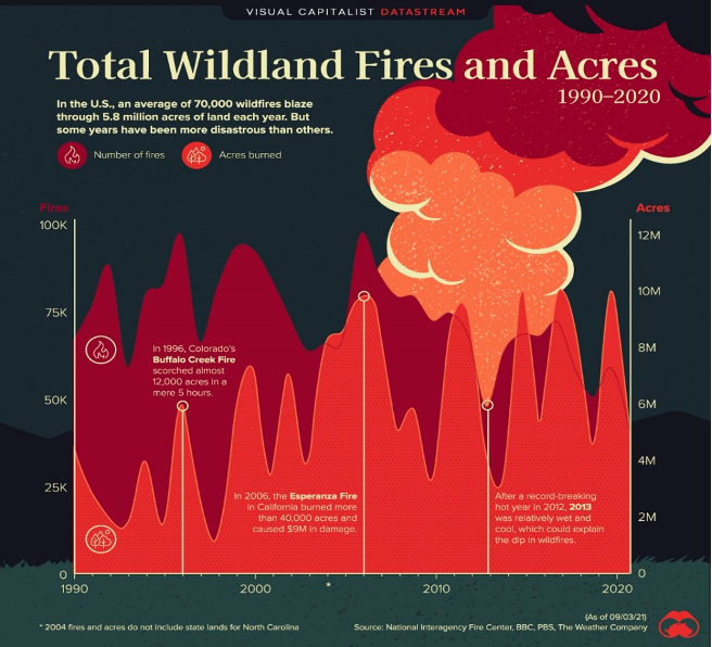
Chart 1: Wildfire incidents in America in a 30-year period
The chart shows the total wildland fires and acres affected from 1990 to 2020. The chart compares the wildland fires events and the extent of damage, in terms of acres burned over a 30-year period. The visualization was designed by Visual Capitalist for the general public.
Evaluation
Data-Ink Ratio
• Layout is hard on the eye
• Use of highly invasive colours
• Use of unnecessary icons on chart
• Distracting background image
Graphical Integrity
• X-axis and y-axis clearly labelled
• Data source clearly quoted
• Data areas are proportional to numerical representation
Gestalt Principle
• Sub-header is deemphasised with a smaller font size
Pre-attentive Attributes
• Header is emphasised using larger font size
Visual Representation
• Ideal chart as area chart works well when you have many dates
• Most important value – number of fires - is at the front/bottom of chart
• Use of annotations to signify important events over the trend
Recommendations
I have redesigned the visualization to better represent the data through the following steps:
• Remove Background image
• Remove fire image and icons on chart
• Replace dark background colour with white for better contrast
• Remove boldness to deemphasise sub-header
• Use of less invasive colours (Pastel colours)
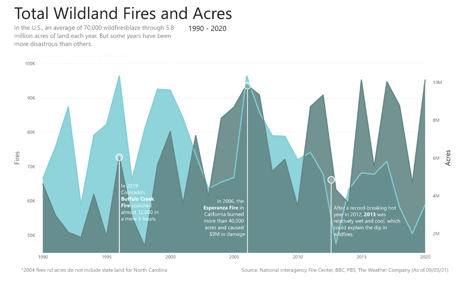
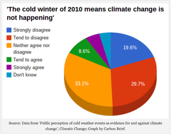
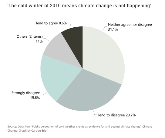
Chart 2: The cold winter of 2010 means climate change is not happening
The chart below is a pie chart that shows the different opinions of people regarding the assertion that a cold winter is evidence of non-existence of climate change. The Graph was designed by Carbon Brief, a UK-based website that covers development on climate science and policy. The chart is intended for the general public.
Evaluation
Data-Ink Ratio
• Good use of background colour – white.
• Choice of colour combination is very invasive
Graphical Integrity
• Survey source clearly quoted.
• Numerical representations match the true proportions
Gestalt Principle
• Principle of Simplicity: No sort order to pie chart (biggest to smallest)
Pre-attentive Attributes
• Unnecessary use of 3D graphic. Pie charts are inherently two-dimensional
• Legend is distracting, as its forcing reader to alternate between it and the pie chart.
• Data values emphasised using colour contrast
Visual Representation
• Wrong use of chart. A Bar chart would be better
• The 3D is redundant as the “depth” doesn’t represent any values
Recommendations
If alternative charts cannot be used to better represent the data, then the Pie Chart can be presented in a much better way. I redesigned the visualization using the following steps:
- Use of less invasive colours.
- Removing the Legend to avoid back and forth and labelling the chart directly.
- Summarizing Strongly agree and Don’t Know as “Others” since no data was provided, reducing the slices from 6 to 5.
- Changing chart from 3D to 2D.
Alternatively, A Bar Chart should be used to better visualize the data. Below, I created a new bar chart that uses less invasive colours and well-contrasted colours to highlight those who disagree with the assertion, with a deeper colour to emphasize the potion of the data we want to draw attention to. Also, the human eye is better at comparing bars than pies.
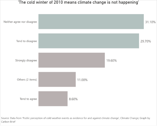
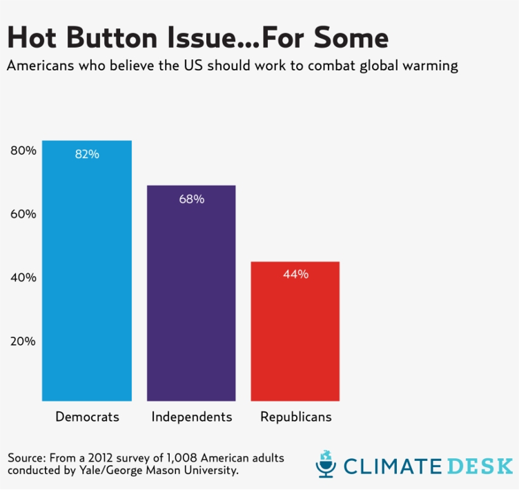
Chart 3: Americans Who Believe the US should work to combat Global Warming
This graph shows percentage of Americans by political demographic who believe the US should combat global warming. The bar chat illustrates the percentage per demographic in contrast to the citizens political divide. The visualization was designed Climate Desk and intended for the general public.
Evaluation
Data-Ink Ratio
• The grey background is redundant.
• The colours on each bar are redundant as the x-axis name already show their difference.
• The y-axis values are reductant as each bar on the chart has already been labelled with the percentage values.
Graphical Integrity
• Survey source clearly quoted.
• Numerical representations match the true proportions
• Y-axis labels are proportional and well aligned to each bar
Gestalt Principle
• Chart is aligned to the left in similarity to other elements like the title
• Sort order applied to chart, arranging bars from highest to lowest. (Law of simplicity)
• The percentage labels are inside the bar elements. (Law of proximity)
Pre-attentive Attributes
• Use of contrast to emphasise data values
• Attention is drawn to header using font size
Visual Representation
• Good choice of chart type (Bar chart) in relation to data.
Recommendations
I have redesigned this chart for better representation, using the following steps:
• Deemphasise sub-header using low contrast colour (e.g. grey).
• Replace bar colour with single low-contrast colour
• Remove y-axis for direct bar labelling
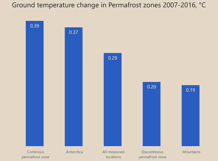
Chart 4: Ground temperature change in Permafrost zones 2007-2016, °C
The chart is a vertical bar that shows change in temperature values in different regions over time. It illustrates the change in ground temperature in Permafrost zones within a decade, from 2007 to 2016. The visualization was designed by BBC for the general public.
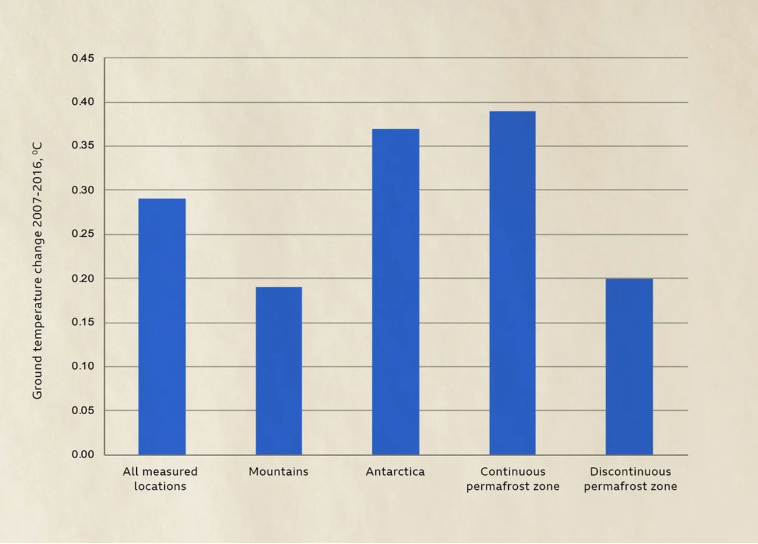
Evaluation
Data-Ink Ratio
• Consistent use of font style
• No unnecessary use bold font
• Background colour provides good contrast for data colour
Graphical Integrity
• Both axes clearly labelled
• Values on y-axis are proportional to bar sizes
Gestalt Principle
• Bars not sorted in order in discordance with the Principle of Simplicity
Pre-attentive Attributes
• Same colour used across all bars
Visual Representation
• Bar chart as choice of chart for discrete values
• Good use of colours
Recommendations
I created a new chart that addresses how the above visualization can be better represented, making the following changes:
• Remove grid lines
• Replace y-axis for direct labelling of bars
• Introduce sort order to bars, from highest to lowest
• Add a title that succinctly captures the data representation
Conclusion
In summary, the quality criteria were picked to capture, at a high-level, standard, widely-accepted principles in the Data Science industry, utilized when desgining charts. We have seen in this article how the application on these principles can make charts more effective, while staying visually appealing.
Reference:
Tufte, E.R. (2001) The Visual Display of Quantitative Information. Second Edition. Cameron Chapman,
https://www.toptal.com/designers/ui/gestalt-principles-of-design